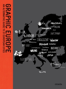
Graphic Europe: An Alternative Guide to 31 European Cities
Edited by Ziggy Hanaor
Cicada Books
288 Pages
Published: April 2010
ISBN: 0956205305
Reviewed by K.E. Semmel
This post originally appeared on the Art and Literature blog today. Thank you to Art Taylor for allowing me to repost it.
Summer Travel
With summer nearly here, it’s time to make your travel plans. If you’re heading to Europe, you can either dust off your overused Fodor’s or your Rick Steves, or you could treat yourself to a new kind of travel guide: Graphic Europe: An Alternative Guide to 31 European Cities.
Your Average Tour Guide, This is Not

The foreword explains: “Graphic Europe is intended to be a beautiful object, but also one that is a usable, functioning travel guide.” By those standards, readers will judge. So you, a judging reader, hold the rough spine in your hands and stare at the cover. There you see 31 city names in 31 different fonts and sizes. Next you flip through the pages slowly, then faster. You see the colors and shapes and images explode before your eyes. Is this a beautiful book? Ja, si, oui, yes—whatever language you choose, this is a gorgeous book. The editor, Ziggy Hanaor, is right about that. But is it usable? If you’d like that answer now, skip down to the subheading below “Places to Eat, Stay, and Drink, etc.” In the interim, I’m going to write about something else.
Authenticity
I don’t really know who Ziggy Hanaor is (a quick web search—I didn’t see her bio anywhere in the book—revealed that she’s the editor of other books, Making Stuff for Kids and Breaking the Mould: New Approaches to Ceramics, among them), but what she’s put together here is a really fun, mold-breaking book. The special touch, she writes in the forward, is that the illustrations by the graphic designers are “a personal interpretation of the cities in which the individual designers live.” It’s that personal touch that’s the very heart of this incredible book—one of the coolest, most original travel guides on Europe I’ve ever seen. If you’re looking for the traditional places found in most common tour guides, I suggest you avoid Graphic Europe. But if you’re game for something altogether different, this is the book for you.
Altogether Different
I’m not a graphic designer, and I realize I don’t have the necessary language to explain why I love the book, but I love and admire beautiful designs, the work of true craftsmen and women. It’s the lines, the color, the fonts, the shapes, the weird angles, the way of seeing something old anew. Fresh images, that’s what I like. Imagine more than 30 of the best designers in Europe coming together to create a mosaic. All each designer had to do was concentrate on his or her own city. And in concentrating on their city they found its pulse, its glowing center, and designed it for the world to see. What’s altogether different about this book is that it flips travel writing on its head, asking the natives of a city to carve the shape of it for others to see.
Places to Eat, Stay, and Drink, etc.
In Graphic Europe you’ll find personalized designs by homegrown artists, native sons and daughters who love their city and want to show it off to the world. But while design tastes vary for each designer—radically and happily—each city is sectioned off very practically with the same simple elements like any good travel guide. In this book they are Places to Stay, Eat, and Drink (bars), plus Shopping, Galleries and Culture, Walks and Architecture, and Events. The result of this structure is a balanced and helpful summation of some of the most interesting things tourists—especially those who are a little hipper—might want to check out next time they’re in Europe. To answer the question of whether Graphic Europe is “a usable, functioning travel guide,” you must know by now that my answer is a resounding jawohl!
Cities
As much as I would love to, I don’t see how I can talk about individual cities. How can I talk about just one? Or two? This is a book you have to hold in your hands and really experience; my words could never approximate the power of seeing it as the art object it truly is. (Luckily for me, since we live in the 21st century you can see exactly what I mean at the book’s Web site right here, and I can avoid clumsily trying to describe it.) But here’s the wonderful thing about this book: There’s something for everyone here. It can simply be a book you love to flip through because it’s just so visually interesting. It can be a book that you look to next time you fly to, say, Riga, because you want to find out what to do there. It can be a combination of the two. No matter how you look at it, this book works. I won’t say it works for everybody all the time, especially for “events,” because the events here are dominated by graphic design events, but it works. On your next trip to Europe you may want to tug along (or put on your e-reader of choice) a traditional tour guide just in case, but Graphic Europe is far and away the one travel guide I would highly recommend to anyone going to Europe, whether for the first or fiftieth time.

No comments:
Post a Comment